Yuki Tamura
Omotenashi is a mobile app that connects to Japanese and travelers to Japan.
Solo (Concept project)
As the designer, my task included research, planning, wire-framing, prototyping, and UI design.
Fall 2019, 5 Weeks
I am thrilled every time I hear visitors say “I love going to Japan”, or “The food is amazing”.
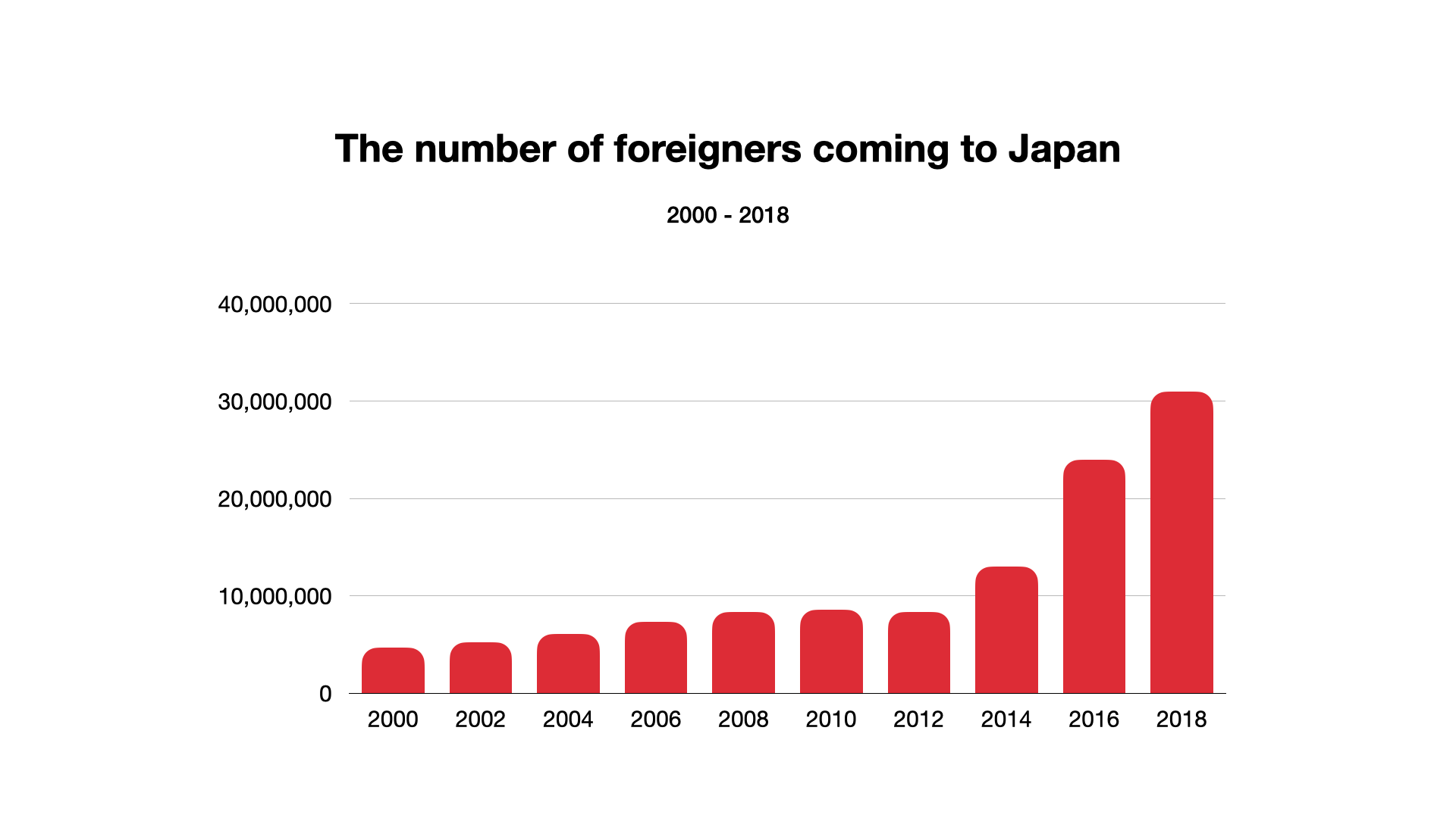
However, I’ve come to discover that the negative sentiment stems from the perception that there is always a communication barrier every time they travel to Japan.
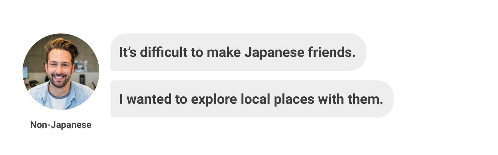
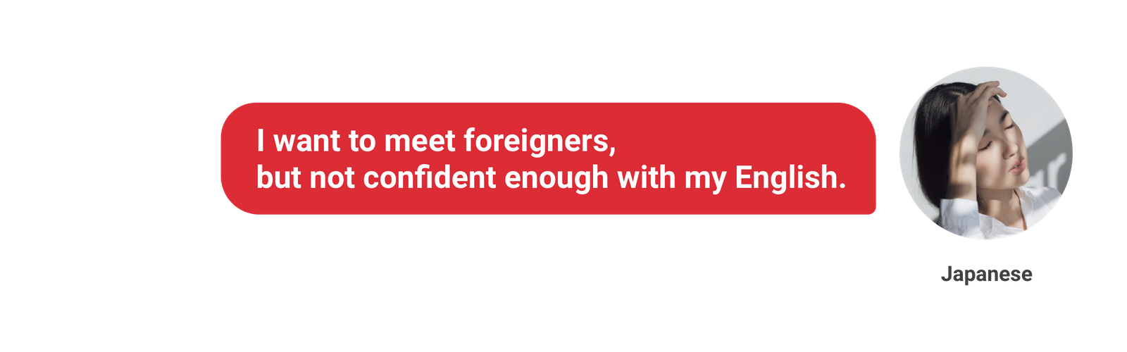
From my personal experience with both Japanese and non-Japanese people,
both parties are interested in interacting with each other but they are lacking a platform to conveniently do so.
Therefore, I saw an opportunity to design an application to connect local Japanese folks with foreign travelers visiting Japan.
Introducing Omotenashi, this mobile app lets users both Japanese and travelers to Japan meet and interact with each other by traveling, exploring local places, and even having coffee together. This platform can build a win-win situation for both travelers and local Japanese people by offering a platform to allow them to interact with each other.
I conducted the end-to-end research and design process, from surveying both Japanese people and non-Japanese people to validating design decisions by usability testing with target users. My design evolved through several rounds of iteration at different stages.
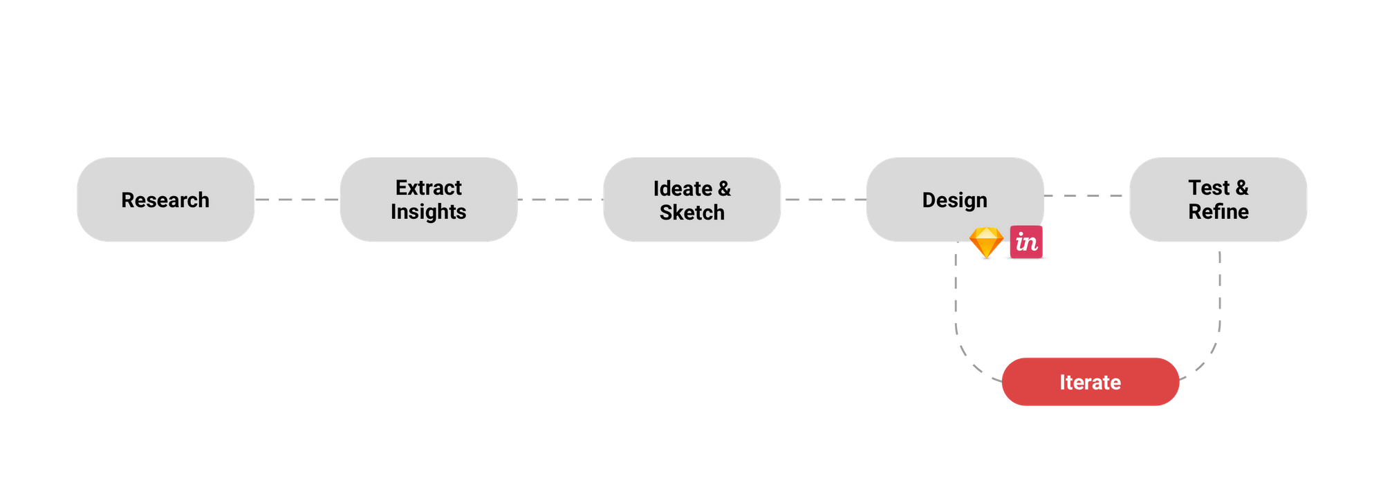
At the research phase, I conducted a user survey and user interview to both Japanese and non-Japanese people to better understand the target audience. I also conducted a competitive analysis to identify their pain points.
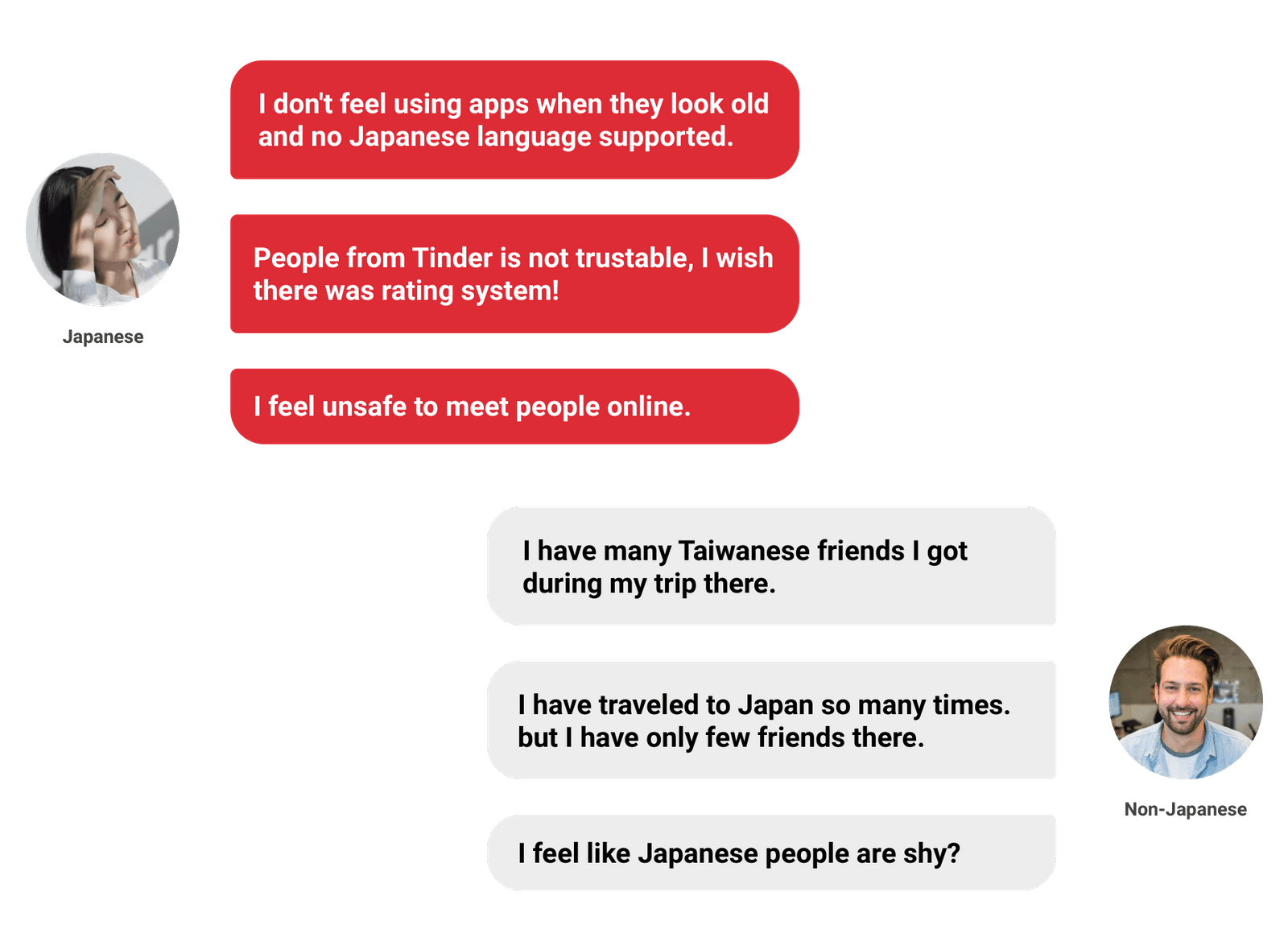
I deployed the survey to non-Japanese people and Japanese people. 73 people were so willing to take the survey I deployed. A sample of the various data got from the participants is shared here.
"Simply wanted to know Japanese real life."
"Want to practice my English."
"I don't want to disappoint them by not speaking their language well.."
I conducted user interviews with 5 people, including both Japanese and non-Japanese people who have traveled to Japan, to dig deeper and better understand the data I received from the user survey.
I also analyzed multiple existing apps, including Meetup, Tinder, CouchSurfing, and TravelPal, to explore the current solutions that users are using to find a travel partner. From this research, I discovered three main issues that led to user frustration.
There are some apps that support you to meet local people during your trip such as Couch Surfing, but most of them do not support the Japanese language. Also, there are no rating systems, therefore, this makes it difficult for Japanese people to trust random foreigners.
Apps are not focusing on casual meetups. The Meetup app is not designed for a casual meetup. From the research, not a few people use Tinder to find a travel buddy or to make friends with local Japanese people. But the respondents noted that most of the time the interactions did not meet their expectations, because you know, it’s Tinder.
The UI on some apps are outdated or too much information on one screen which confuses and overwhelms users. There is a very good app called TravelPal for finding local people to show them around when you go travel to different countries, but the app is glitchy and design is outdated. As a result, the application received many reviews that complain about the app on the app store.
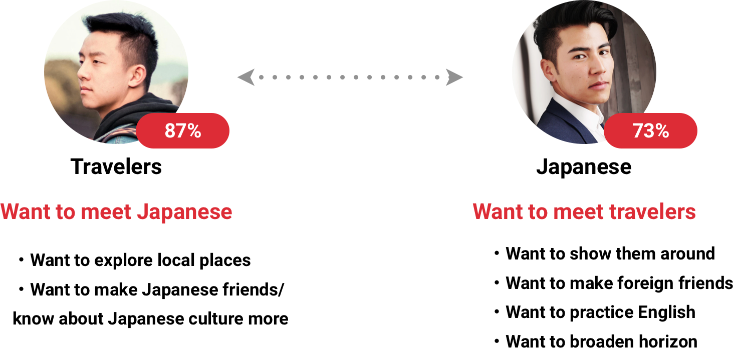
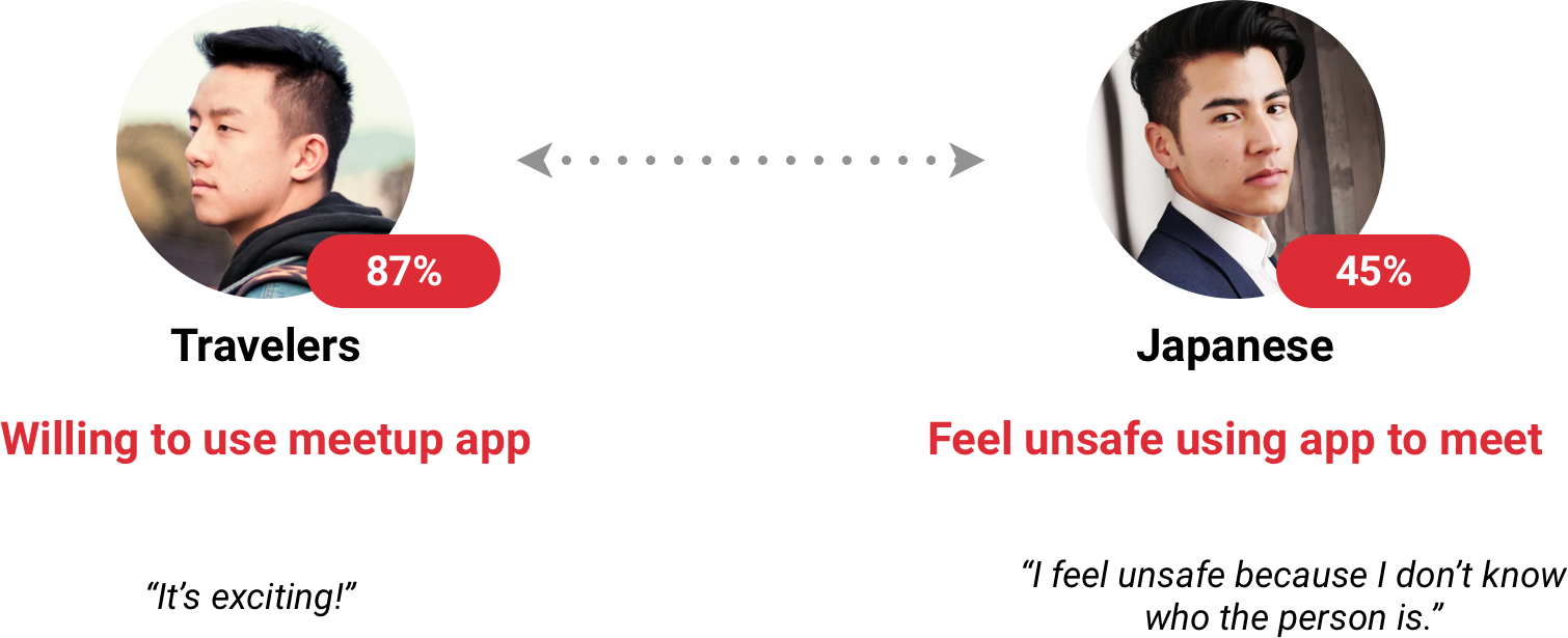
Travelers don’t care about it.
75% of Japanese people will want to meet foreign travelers.
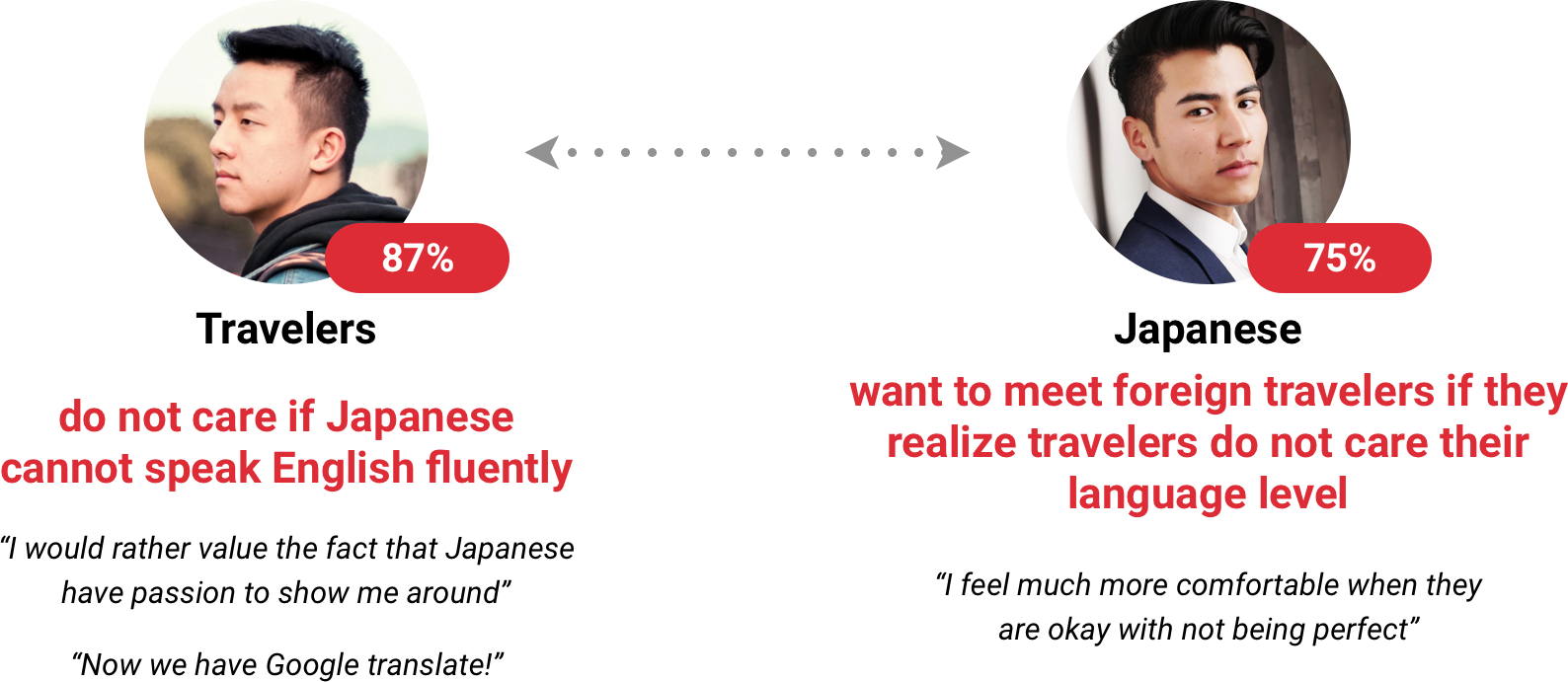
From this, I hypothesized that I needed to give them a method to better understand the other users.
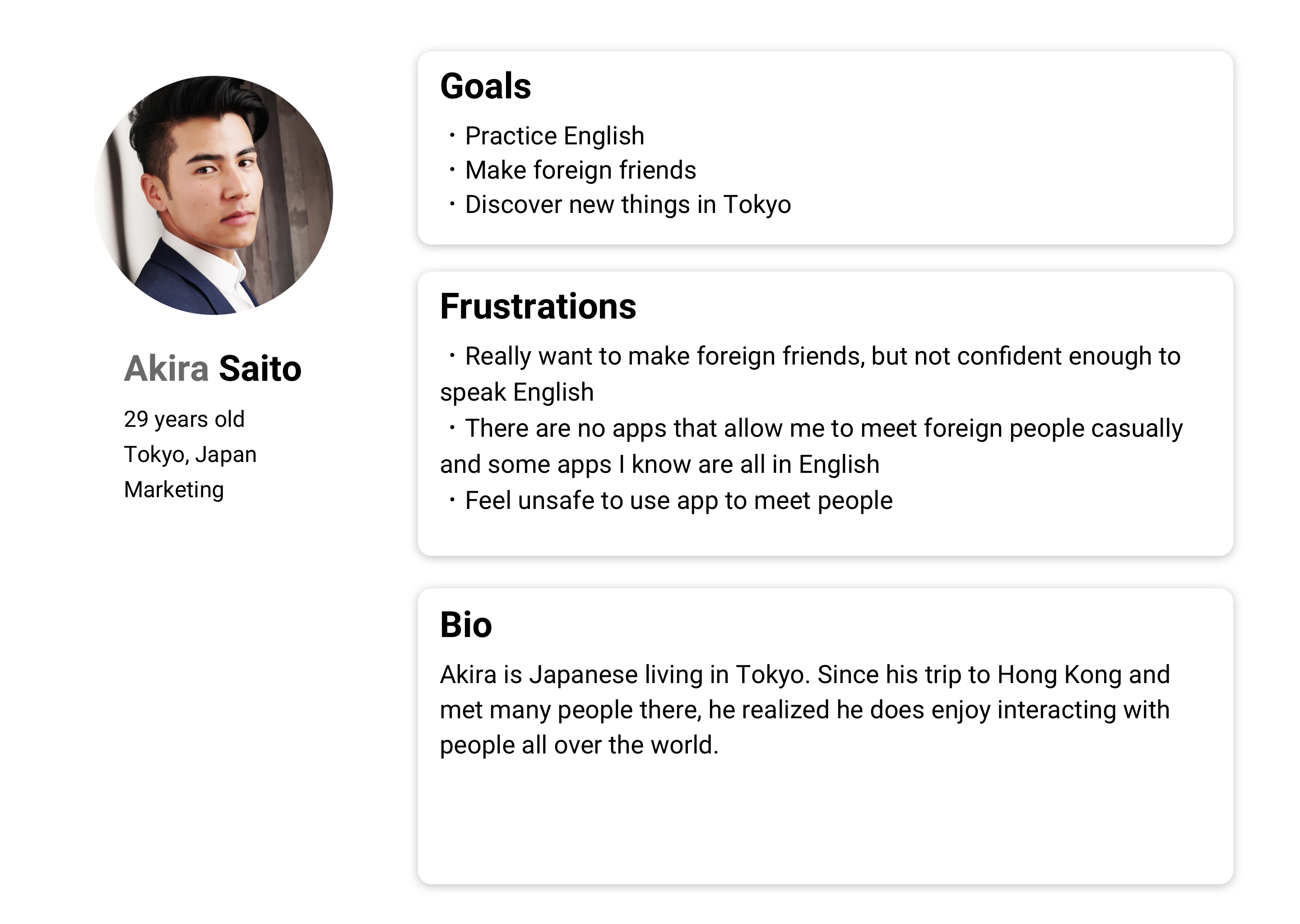
At this stage, I defined the problem statement I was trying to solve. I realized most of the pain points were coming from Japanese people. Therefore, I decided to prioritize to optimize the app more for Japanese.
I created multiple Japanese and traveler’s personas based on the initial research. The personas represent users’ goals and pain points which helped me prioritize different user needs to guide the converging phase of my design process.
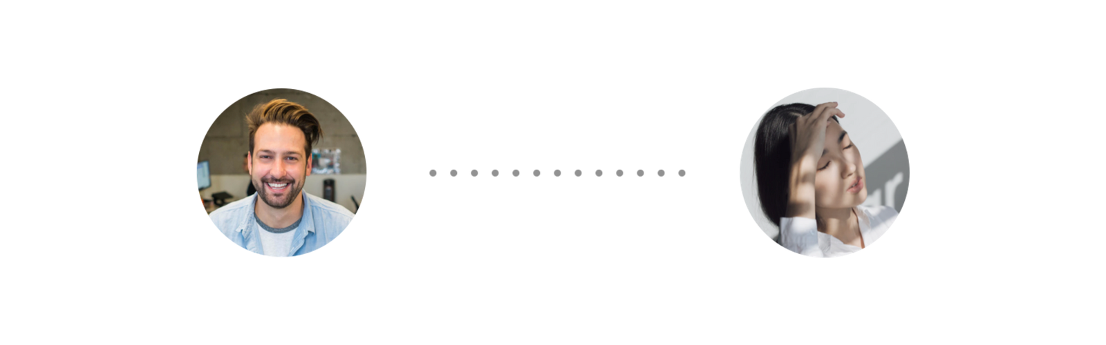
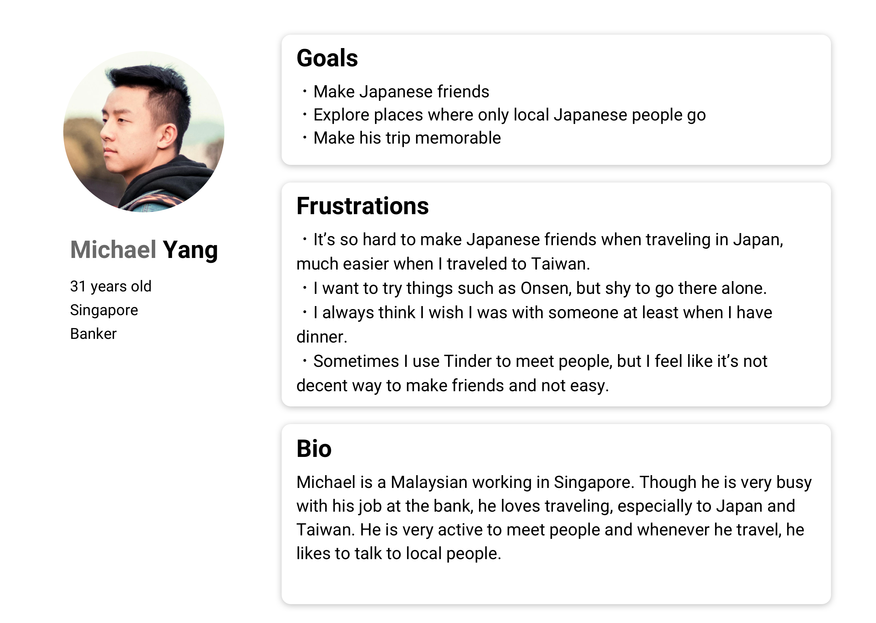
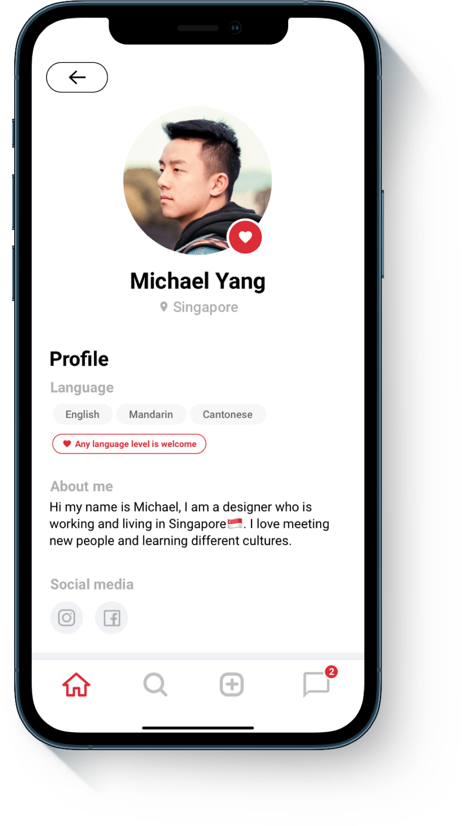
Meet Akira who is a Japanese living in Japan, and Michael who is a traveler to Japan from Singapore.
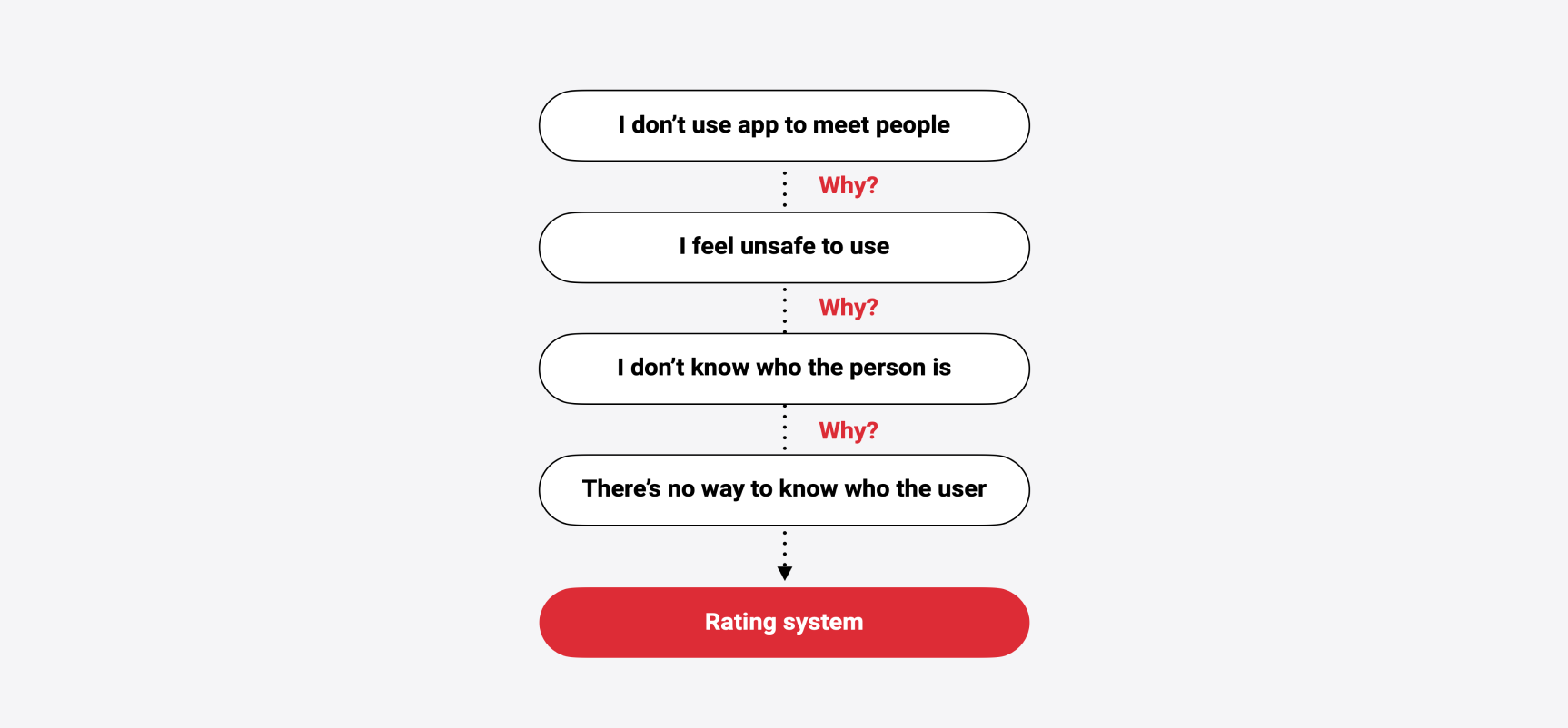
I brainstormed for possible design features. During research phase, I always asked myself why? to each problems that users have to dig the pain point deeper and reach possible solutions.
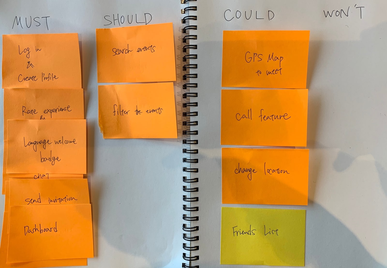
I also used MoSCow Diagram to define the core of the product's features based on personas' needs.
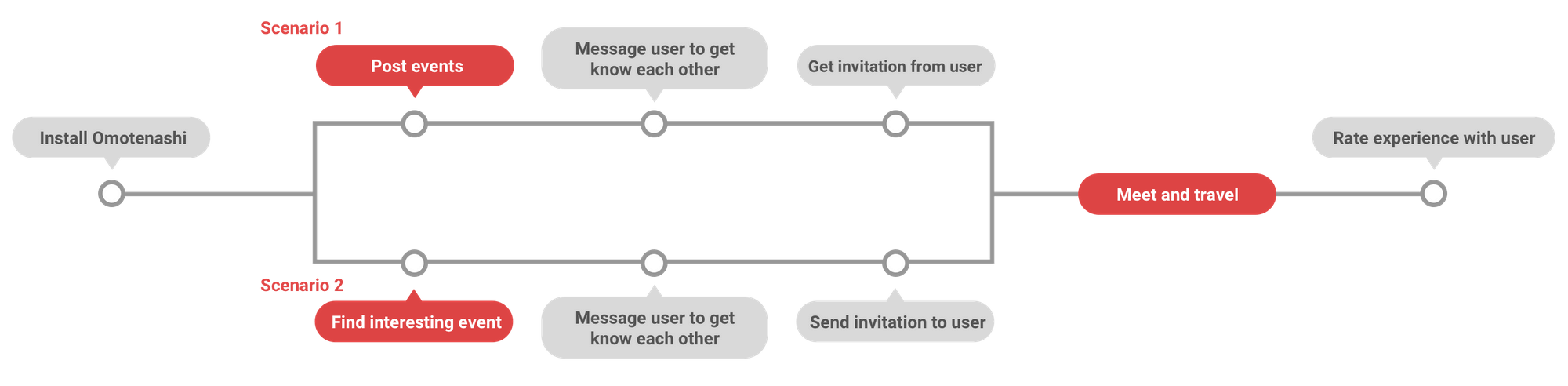
Once I got what I want to have in my app, I mapped out user flow.
Before starting any design, I conducted to create information architecture.
Nothing’s simpler than starting out with a good old pen and paper.
For design reference and inspiration, I looked at some apps and got some inspiration.
Finally, through usability testing and several rounds of iterations, I finally arrived at the designs shown today.
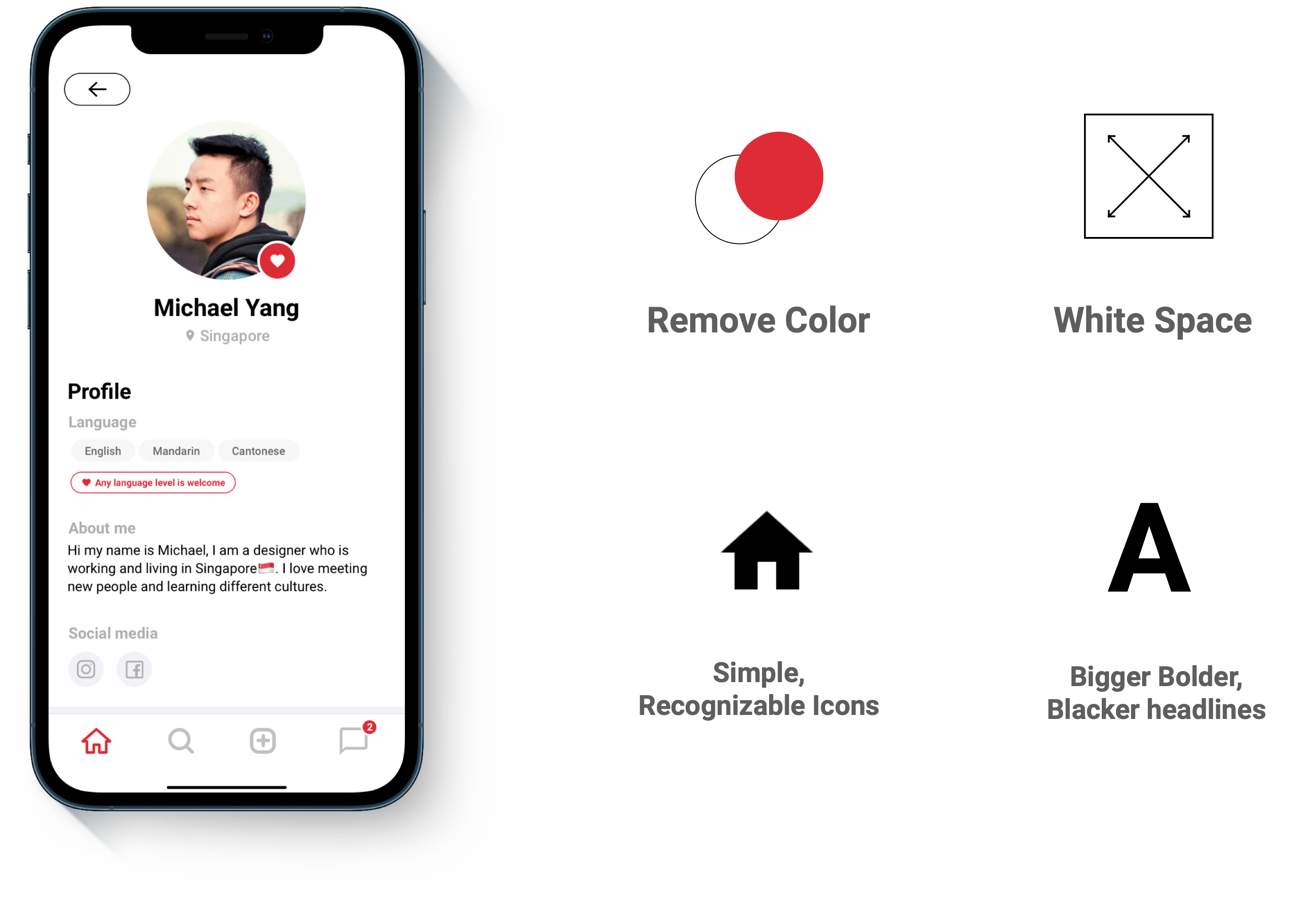
“You open an app for its functionality, not its personality” Following these principles, I removed excess color for minimalization, I added white space, I adopted simple icons, I added bigger bolder, and darker headlines.
Several rounds of usability testing helped me to achieve a better and simple flow for users.
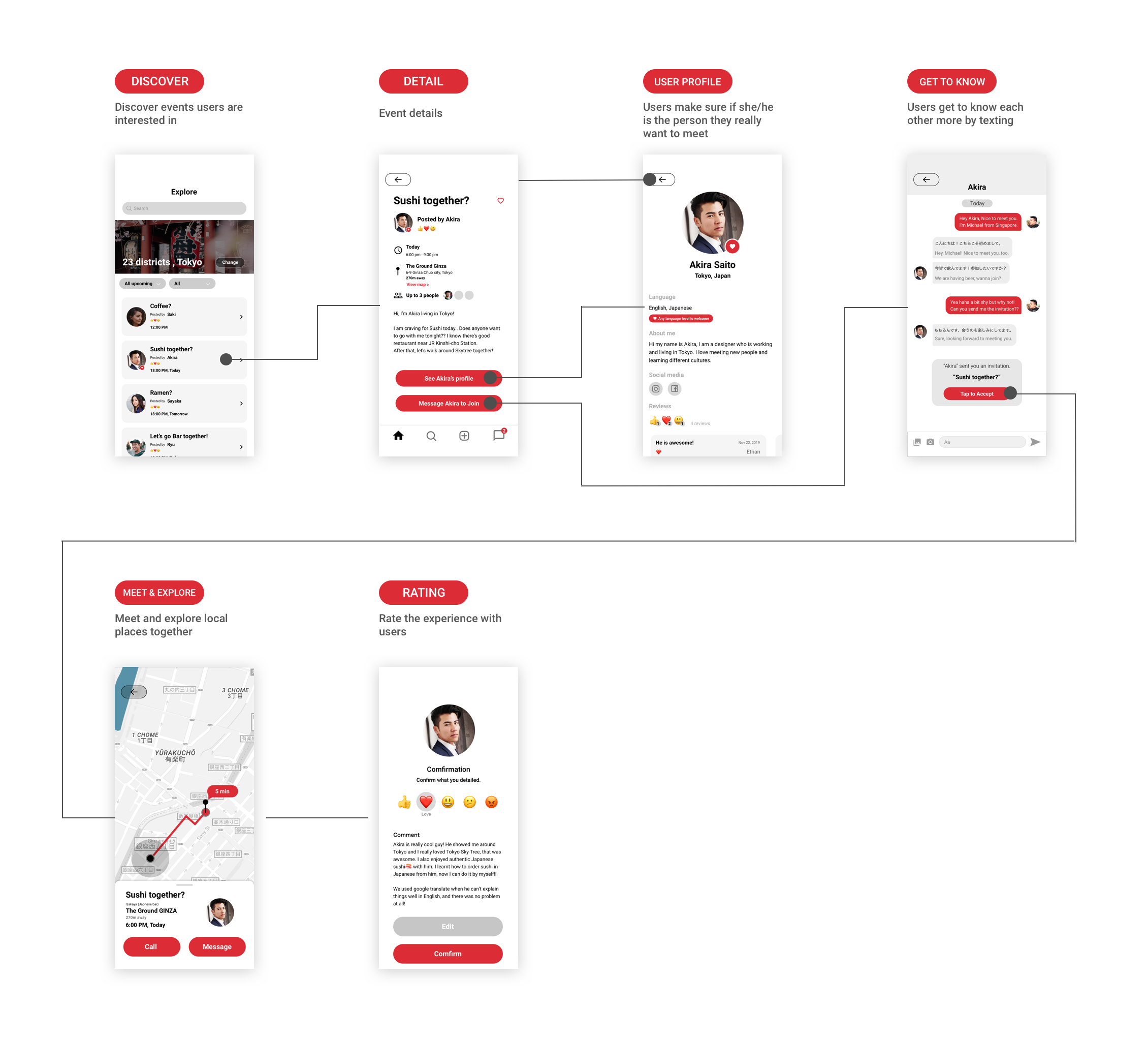
From my research, I’ve implemented this badge to make it easier for Japanese people to meet travelers more easily than before because now they know they are okay with not speaking English fluently.
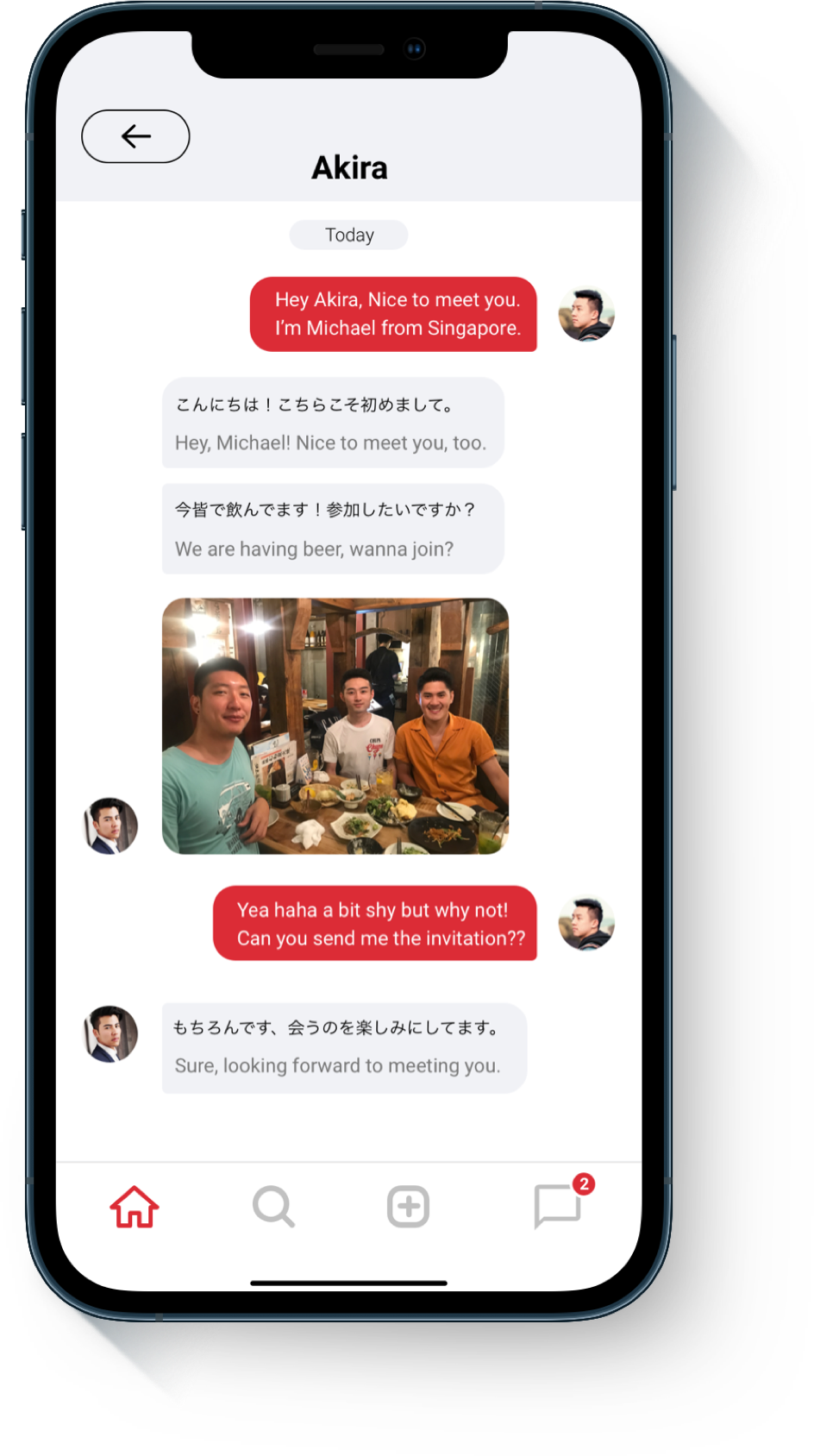
When users message, the app automatically translates what they typed to either English or Japanese.
My research and usability testing revealed that it makes users’ conversation smoother.
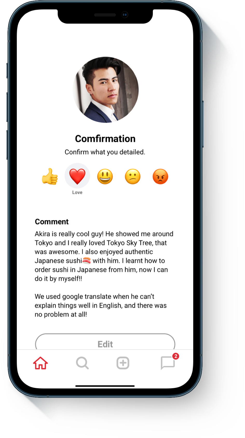
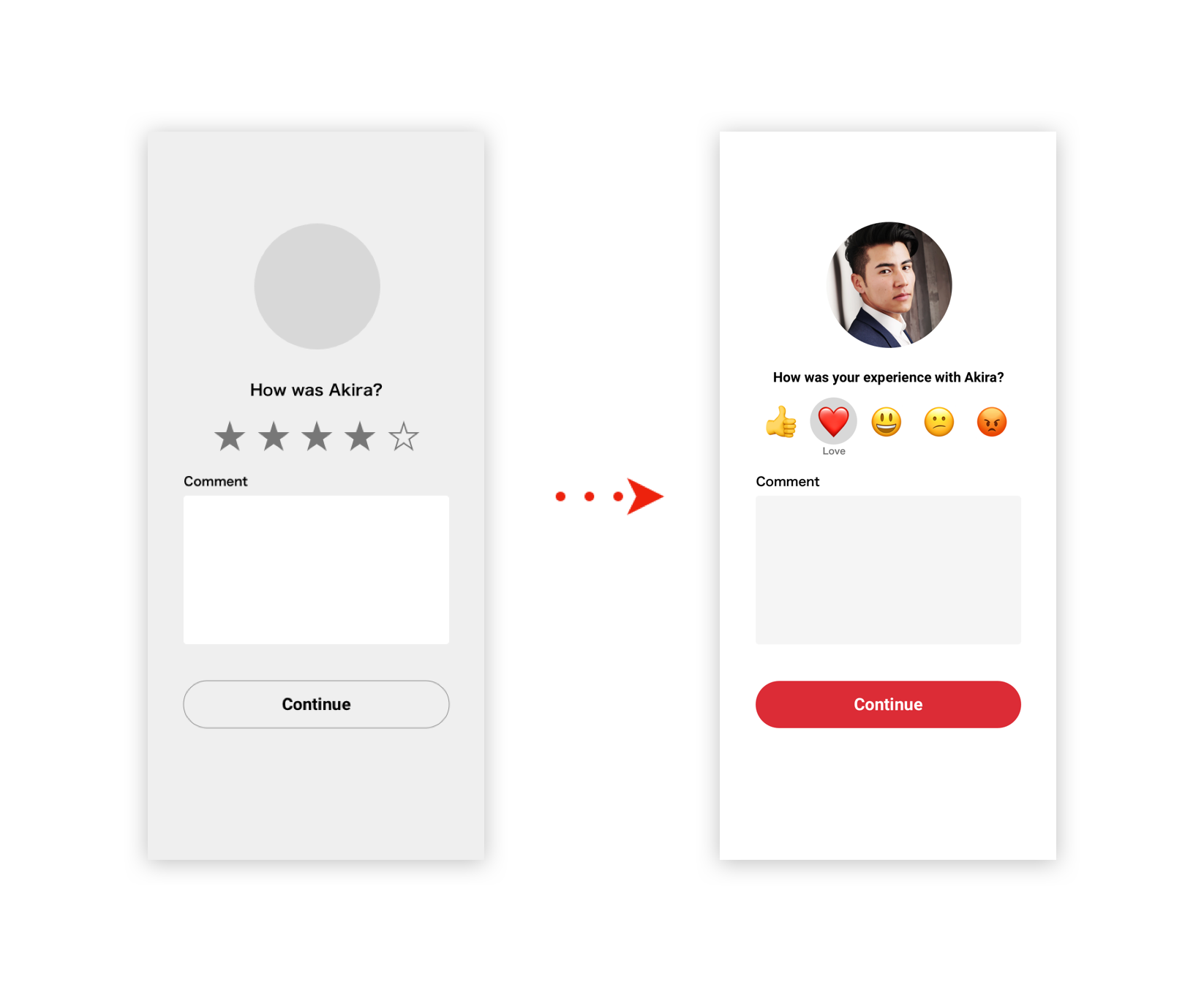
Now users can rate their experience with other users after they meet them.
This is one thing that other apps don’t have and a lot of people were pleased with having this rating system during usability testing.
The ratings will be on users profile, and it helps users get to know each other and how they interact with other users on the platform.
During the design phase, I conducted usability testing several times. Testing with users enables me to identify spaces for improvement and refine my design for better usability and experience that caters to users’ needs. Below are some design improvements that I made during the testing phase;
I changed the way to rate experience with users. During the testing, some people mentioned that they would hesitate to rate users or they would only rate 1 or 5 because they can’t treat people like products on Amazon. I put five emojis that users can express their feeling and experience with other users.
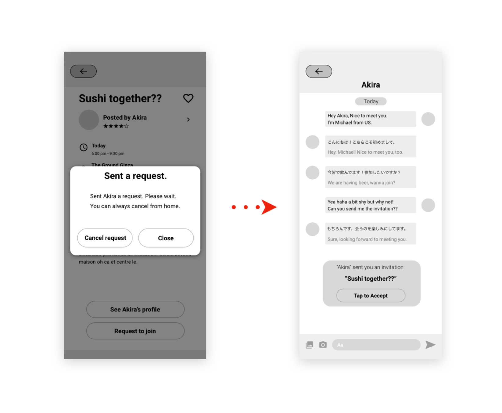
I changed the way to join events. Initially, there was a “Request button” on the event page to send a request to the event host to join the event. But from the usability testing, I got some feedbacks such as “I want to chat with people to get to know each other first before meeting people.”, so I enabled event hosts to send the invitation to users who want to join when they feel meeting them.
During this project, there were many iterations based on research, usability testing, and critiques from other designers and people around me. It was a long process, but I was excited as the designs become more optimized for the users. Being born in Japan and having lived most of my life in Japan, this app was something that I was really passionate about. There were so many things where I wanted to leverage my experience on this project, but I always kept this quote in my mind;
“As a designer, you need to remove your ego. You design things not for you, for others”.
It was also challenging that I needed to consider and approach things from two sides: both Japanese and non-Japanese perspectives, but trying something I have never done before is always exciting for me. I will keep polishing my design for this app and making it better for users and for myself as one of the designers.
I appreciate all my friends who have been supporting me and made me realize that learning different cultures is really fun.
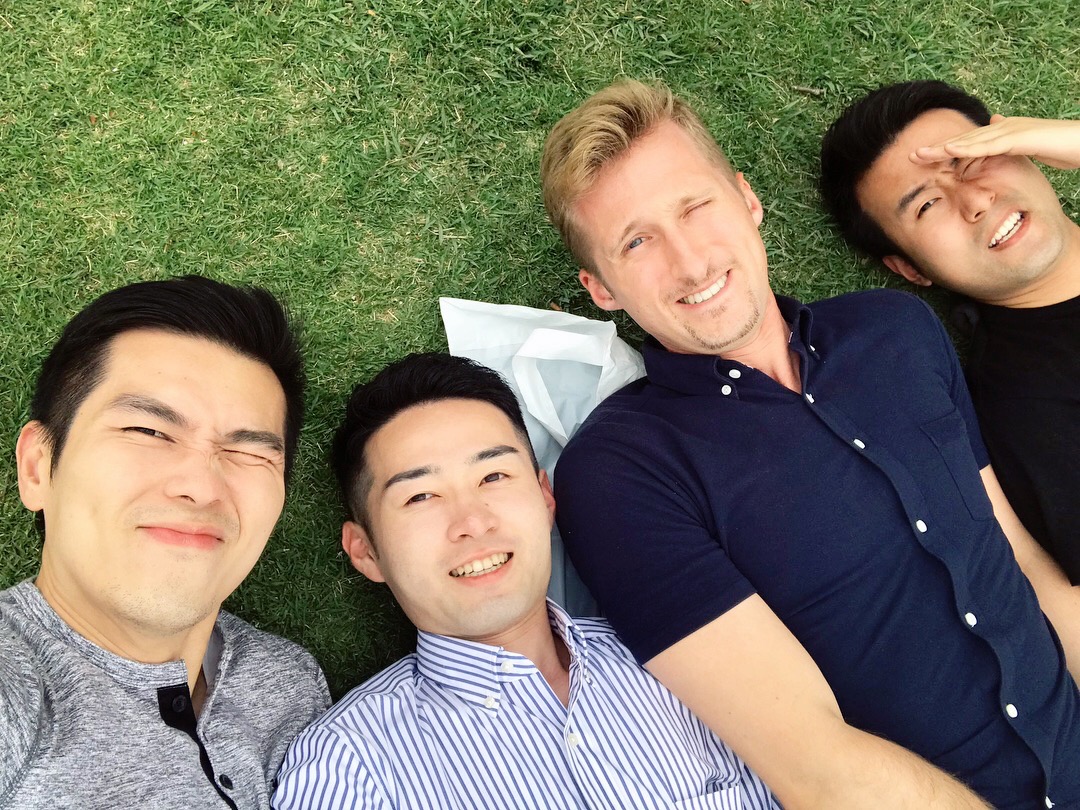
TOKYO FRIENDS
My best friends from Malaysia, US, and China, all living in Japan.
"It's so hard to find people who want to have conversation."
"Japanese people seem so busy."